GRUNGE · PATROL NIGHT
Patrol Night Grunge
Patrol night drawn in the grunge style. Blue and red light on wet road, the rest of the frame left dark.
- 9
- preview renders
- Grunge
- art style
- Blue
- dominant hue
- 8 October 2026
- artwork updated

What you get
This design renders into 9 of the catalogue formats, each one composed for its own crop. Every size below is the pixel size the target platform actually stores, not a resize of one wide image.
- FiveM info banner1865×108
- FiveM connecting banner1920×320
- FiveM loading screen1920×1080
- Discord server banner960×540
- Discord profile picture300×300
- Forum signature650×250
Dominant hue: Blue, measured from the rendered artwork. The default for anything that wants to read as organised rather than exciting.
Every render of Patrol Night Grunge
9 formats, each at the size the platform expects. Where the platform accepts motion, the animated encoding it is built to is listed under the still.

FiveM info banner1865×108 · GIF FiveM connecting banner1920×320 · GIF 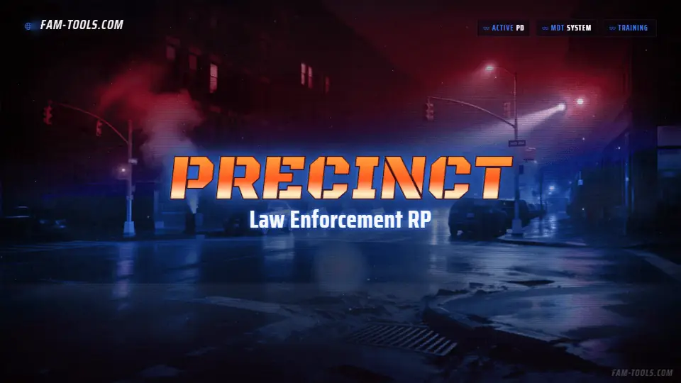
FiveM loading screen1920×1080 · MP4 + resource 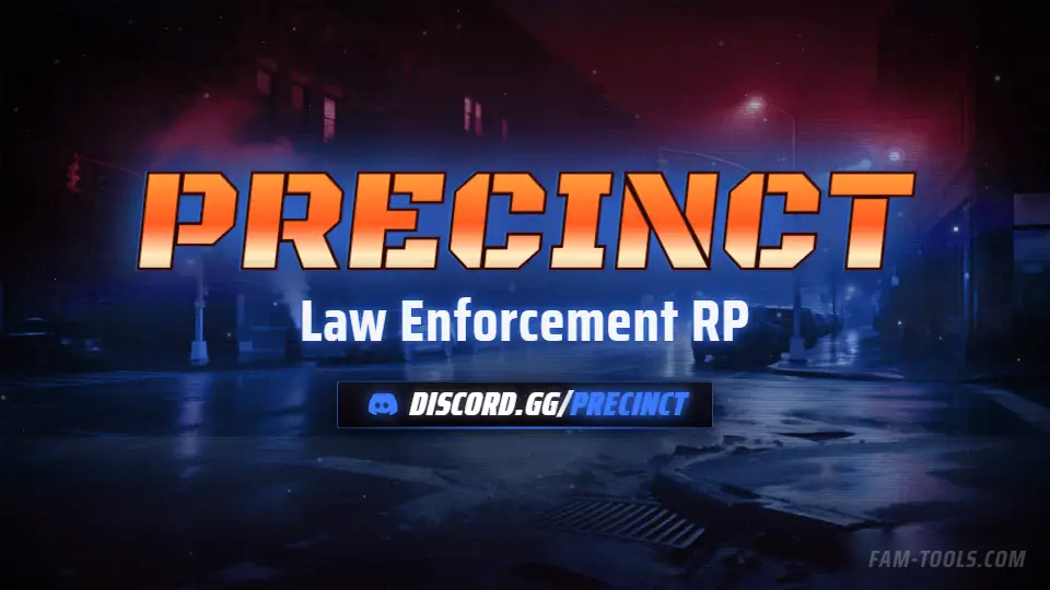
Discord server banner960×540 · GIF 
Discord profile picture300×300 · GIF 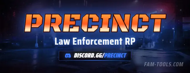
Forum signature650×250 · GIF 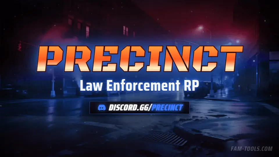
Twitch offline screen1920×1080 · MP4 
Twitch panel320×100 · GIF 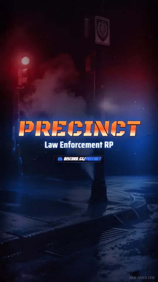
Story / Reel1080×1920 · MP4
The grunge style
Torn edges, print texture, heavy grain, desaturated bases. Suits crime and street roleplay far better than a clean gradient.
Grunge is the only style here that uses texture as the subject. The plate is desaturated and damaged, the accent is the single clean thing in the frame, and the contrast between the two is what carries the composition.
It is the right choice for serious crime roleplay, gang servers and anything positioning itself as gritty, and it is the wrong choice for anything that wants to look welcoming. It is also the hardest style to keep legible, because texture competes with type at every size.
Practically: grunge plates need a heavier outline weight on the wordmark than the other three styles, which is why the default stroke setting is higher on these designs. Turning it down makes the lettering sink into the texture.
The patrol night scene
Blue and red light on wet road, the rest of the frame left dark.
Built around two opposed light sources, which is a composition that only works at night and only works once. The red and blue are structural rather than palette, so changing the accent shifts the ribbon and lettering without fighting the scene. The obvious choice for law enforcement departments and emergency services branding inside a roleplay server.
The same scene is also drawn in anime, painted and photoreal.
Blue as a server colour
The default for anything that wants to read as organised rather than exciting.
Blue is the most common accent in roleplay branding, which cuts both ways: it signals competence and it does not stand out. Where it genuinely helps is the emergency-services and law-enforcement side of a server, where blue is already the colour of the thing being depicted. Keep it saturated; a muted slate blue is one of the colours that disappears into Discord's sidebar.
Close to this one
Same scene, same style or same hue.
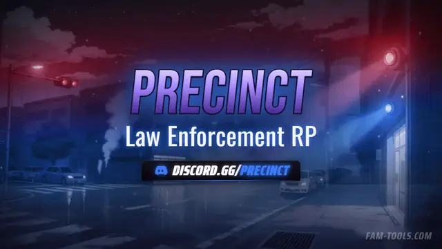
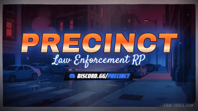
Patrol Night Anime
Blue and red light on wet road, the rest of the frame left dark.
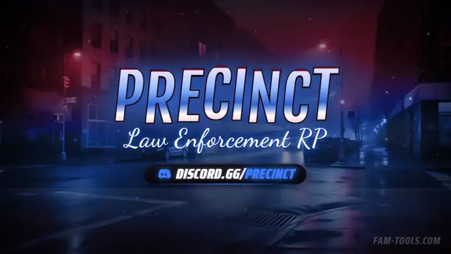
Patrol Night Painted
Blue and red light on wet road, the rest of the frame left dark.
Patrol Night Photoreal
Blue and red light on wet road, the rest of the frame left dark.
High Fantasy Grunge
Spires, impossible geography and light coming from somewhere there is no sun.
FAM Tools is an independent studio. We are not affiliated with, endorsed or sponsored by Take-Two Interactive, Rockstar Games, Cfx.re or the FiveM project, and we neither own nor license any Grand Theft Auto asset. Every graphic shown on this page was drawn and rendered here. Platform names are used only to describe which slot a file is sized for.